This project begged for a totally new radical approach to how school administrative software has been traditionally used. We found that school administrators were often overwhelmed with angst and skepticism with their software choices. Trying to complete mundane daily record-keeping tasks were frustrating because the software seemed to lack empathy for the user — tabs galore and a new skin on Excel is not a great solution.

HIGHLIGHTS
- Unique Interactions: Using dragging and dropping from an item to a particular hotspot was the main way to create the coupling of data connections. This made it easier to create relationships and let the complex associations happen behind the scenes.
- Information Architecture: Determining family relationships, who lives with which parent, multiple addresses, and siblings in multiple schools, and how to navigate it all were just some of the complexities in the data models.


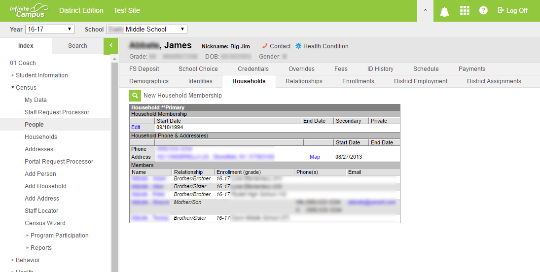
Below is a screenshot of the original software. Whenever there are two rows of tabs, there’s a problem with the UX or information architecture. School software is usually sold to the school district executives, with little input from the actual day-to-day users, parents, or advisors actually in the weeds using it.


