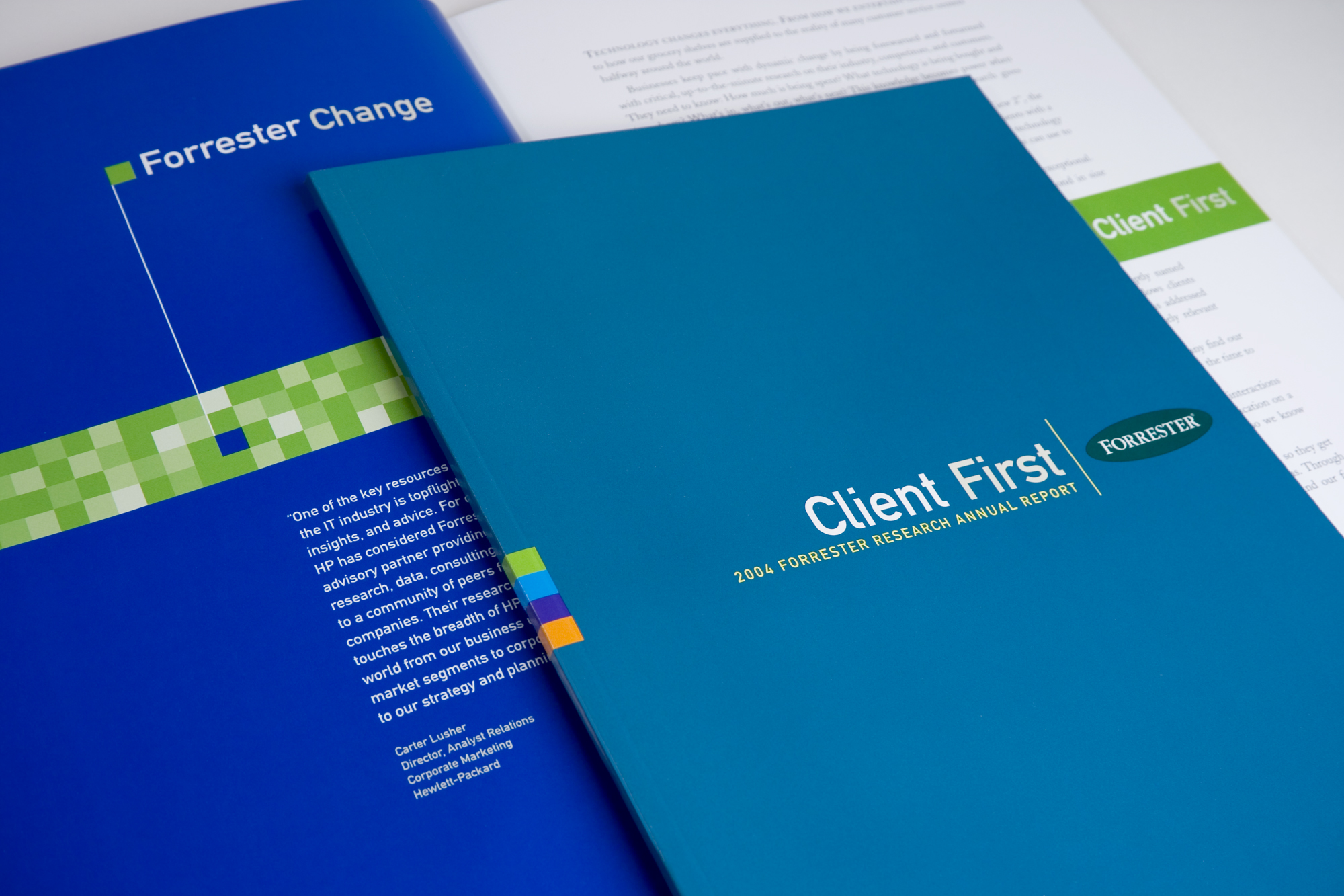
From the get go, the client really didn’t want any strategic concepts or strong messaging. They just asked for it to be designed clean and simple. During this period the digital world was exploding along with the need for consulting services within this new space. The minimalistic design subtly depicted a pixel standing out from the other sea of pixels, and matched with a single company message, here, “Forrester Change.” At the end of the pixelated row was a clear, legible, and distinct message, “Client First.” This bridged the priority of personal consulting services within a new digital world. (Agency: Smizer Perry)


