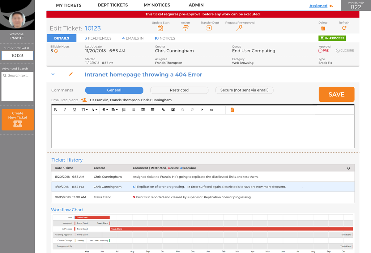
Speed and easily-accessible information were two key aspects missing to greatly enhance customer service. Much of the workflow couldn’t be changed, but a new eye to streamline and improve the IT’s help desk app was very much in need. From a higher-level design concept, having a busier layout with more information on-screen at once was the most effective solution.

HIGHLIGHTS
- Environmental Factors: Simply turning customer service reps’ monitors vertically allowed for longer tickets to display more information at a glance rather than constantly scrolling up and down.
- Hierarchy of Information: Switching the emphasis from the data labels to the actual data item — via layout, typography, and color — vastly improved speed and recognition.
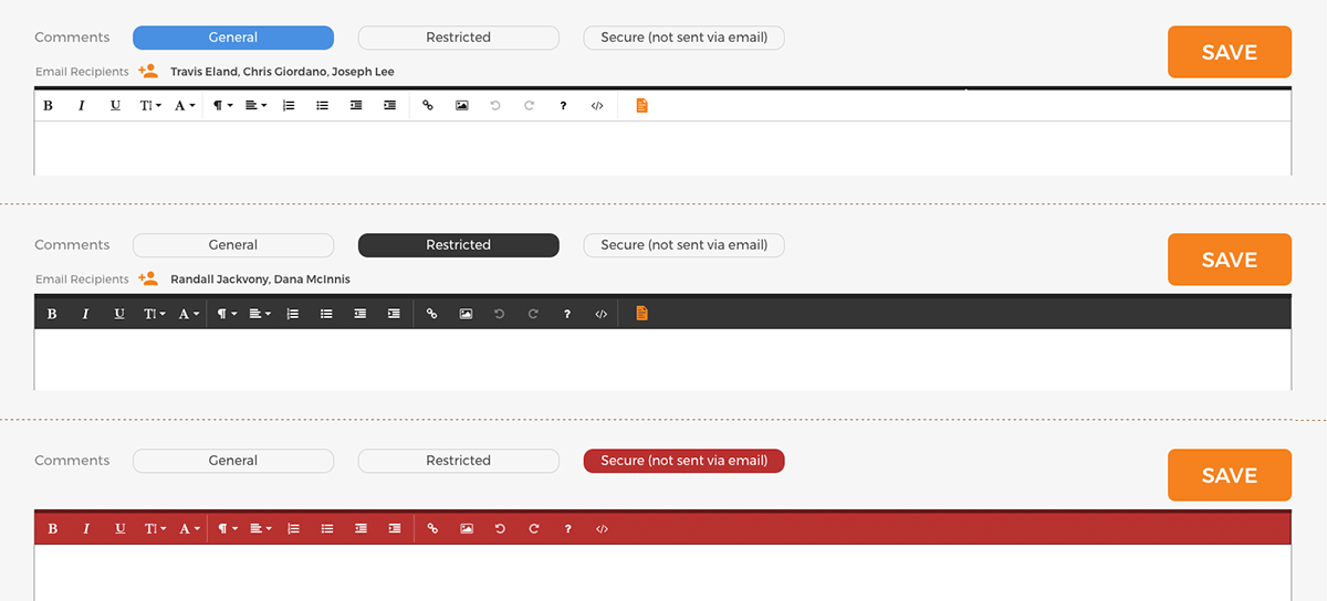
- UI Frameworks: Changing the color and position of pre-existing buttons along with skinning the theme colors for the rich-text editor bar made it absolutely clear (and incredibly important!) as to what comment was being added.


