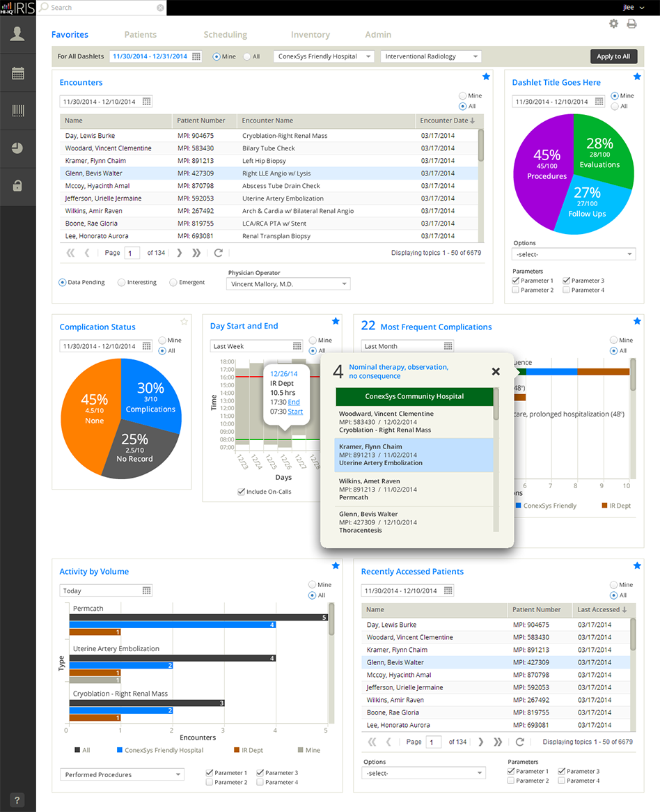
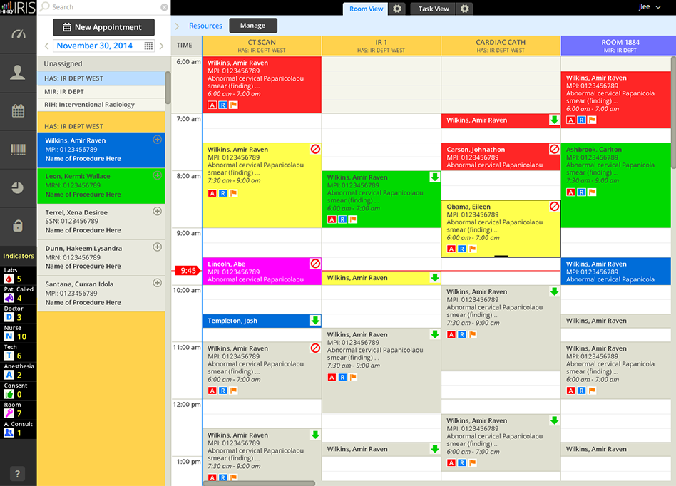
A complete healthcare software suite focused specifically on Interventional Radiology: dashboards and reporting for hospital management, scheduling component with real-time tracking of patients’ progress, data capture for medical procedures, and a complete inventory system from ordering to receiving and consuming. HI-IQ moved from an individually embedded on-site system to fully cloud-based, and needed a complete overhaul examining every single method and process for a better and more efficient UX.
HIGHLIGHTS
- Personas & User Research: We had a large amount of customers currently using the software so we were able to leverage a wealth of information as to what worked well and where the major pain points were. Extensive interviews with doctor’s, radiology technicians, nurses, schedulers, and inventory managers were just some of the people involved in the total redesign.
- Pilot Users: A few doctors and nurses, at both small and large hospitals, were pilot users so we got great feedback on new features used in actual live procedures.
“WOA! Hold on a sec…. Take 2!”
When I joined this company, a well-known medical websites consultancy had already been hired and well underway in the redesign process. Within the first few days, the company leadership asked me what I had thought of the new vision. I said, “We don’t have a ‘webApp.’ We have a ‘webSite.’ “ I spent the next two weeks explaining, demonstrating, and redesigning the consulting firm’s work.
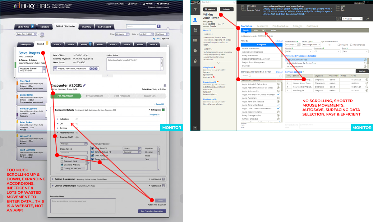
- Interactive Analysis: Often successful usability is determined by the number of interactions to do a task, but what about the excessive amount of moving around to do the same task (see items in red which represents a click-and-move analysis)? The consultant’s failed design at Left, and my streamlined redesign (of the redesign) at Right.
- Taste It As You Go: All great chefs taste their food throughout the creation process — not just at the end. Designers must do likewise — use their designs continuously! By simply using my finger on a paper layout (and knowing where the bottom of the monitor was), I was able to see how inefficient the layout was for entering data hundred of times a day.
“I think we need another modal?”
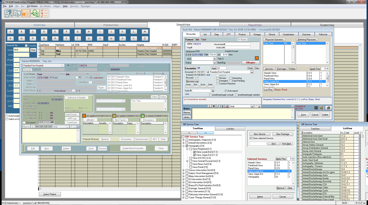
This is the original design of the software with 20 years of improvements, or shall I say, 20 years of cramming in new features. Higher-level concepts must be determined before execution of design details should even be considered. Remember this is medical software: legibility for accurately entering data is paramount; surface data rather than burying frequently used items, or life-saving information; know at all times how to navigate and where you are. (“Uh, which window is currently active?” Yes, below is an actual screenshot.) These are just some of the higher-level “ideas” that must be thought of — even before sketching on bar napkins.