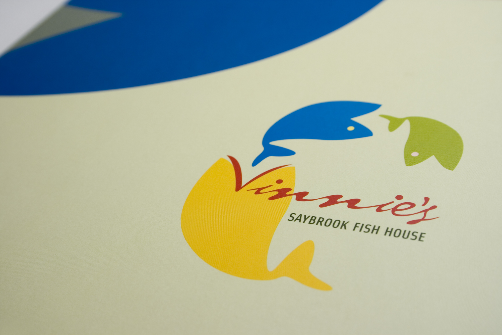
Legendary and iconic, but stagnant, seafood restaurant located in Saybrook, CT was sold to a new owner and it desperately needed an updated modern brand. During a visit on-site, I notice a wonderful sculpture on the patio showing fish eating fish. I was told the sculpture had been there for years — it had history. This was a perfect motif to bridge the old to the new!
There are quite a bit of design techniques going on with the final branding. The flat colors create a 2D space, yet the overlapping wavy seawater-like typeface adds dimension which creates some ‘good’ visual tension. Notice the lips and eye are also the beginning of the name of the restaurant. This helps unify the logotype with the logomark. The whimsical abstract fish shapes liven up the brand with a fun, but sophisticated feel; and by being in a circular arc, your eye leads back to the name for focus. Sweet! (Agency: Smizer Perry)


