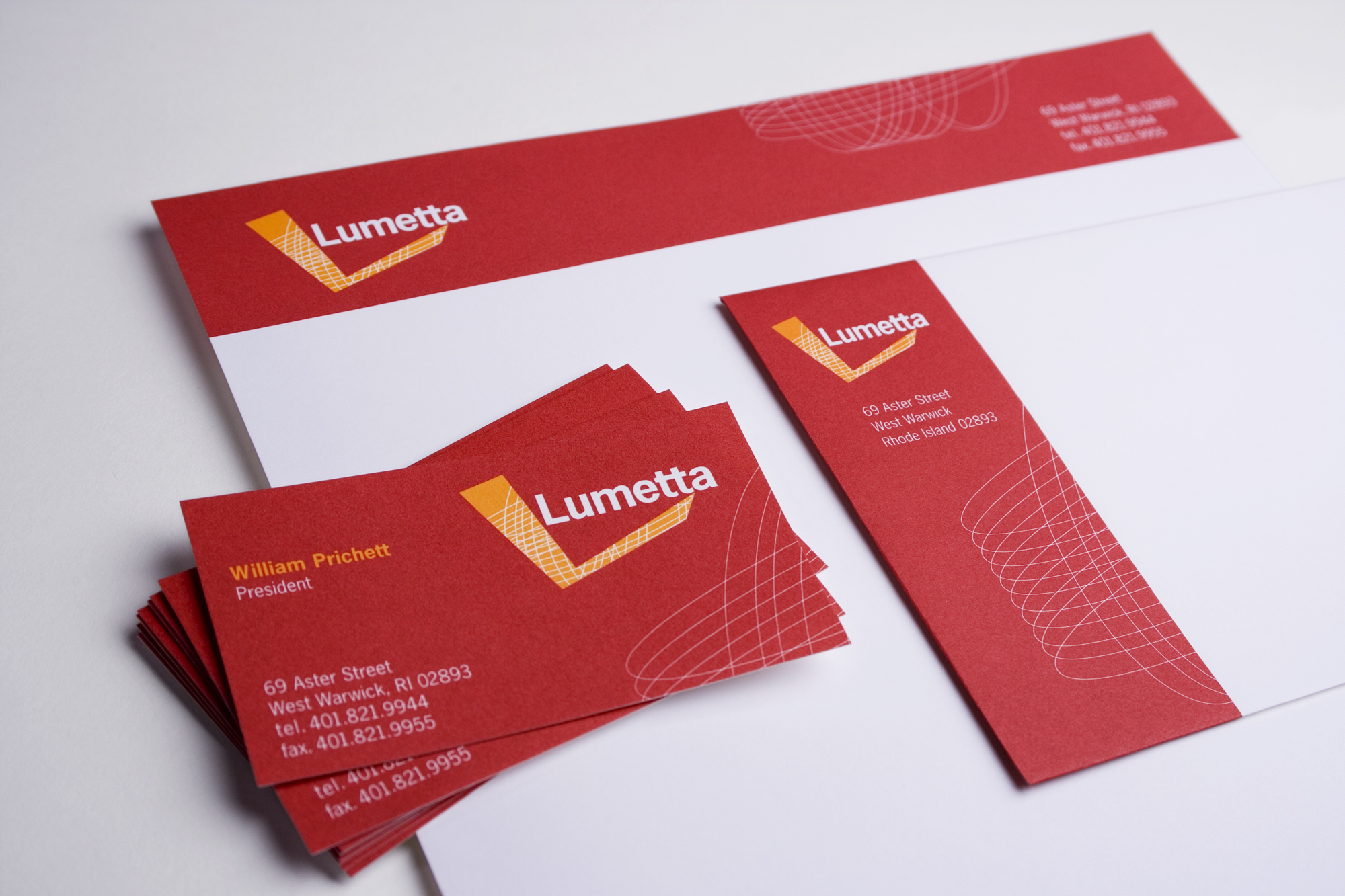
I asked this high-end architectural lighting manufacturer to allow me to visit their operations. The owner was skeptical and didn’t really know why I wanted to be there, but I convinced him that inspiration comes when (and where) you least expect it. As I viewed the manufacturing area, I noticed fabric clippings everywhere. They were from their proprietary sconce designs.
Investigating further, this was really what made them unique. Their sconce designs set them apart and got noticed by architects and interior designers first. Thus, the L is an abstract clipping and became a memorable logo. In addition, I wanted them to go big so I introduced a fully red card. At first they were wary, but when I put a prototype in a stack of cards they immediately saw theirs stand out. Sold!


